UI Overview
The Panels
The UI has 3 Panels
- The Top App Bar (AppBar)
- The Left Navigation Bar (NavBar)
- The Main Panel (Main)
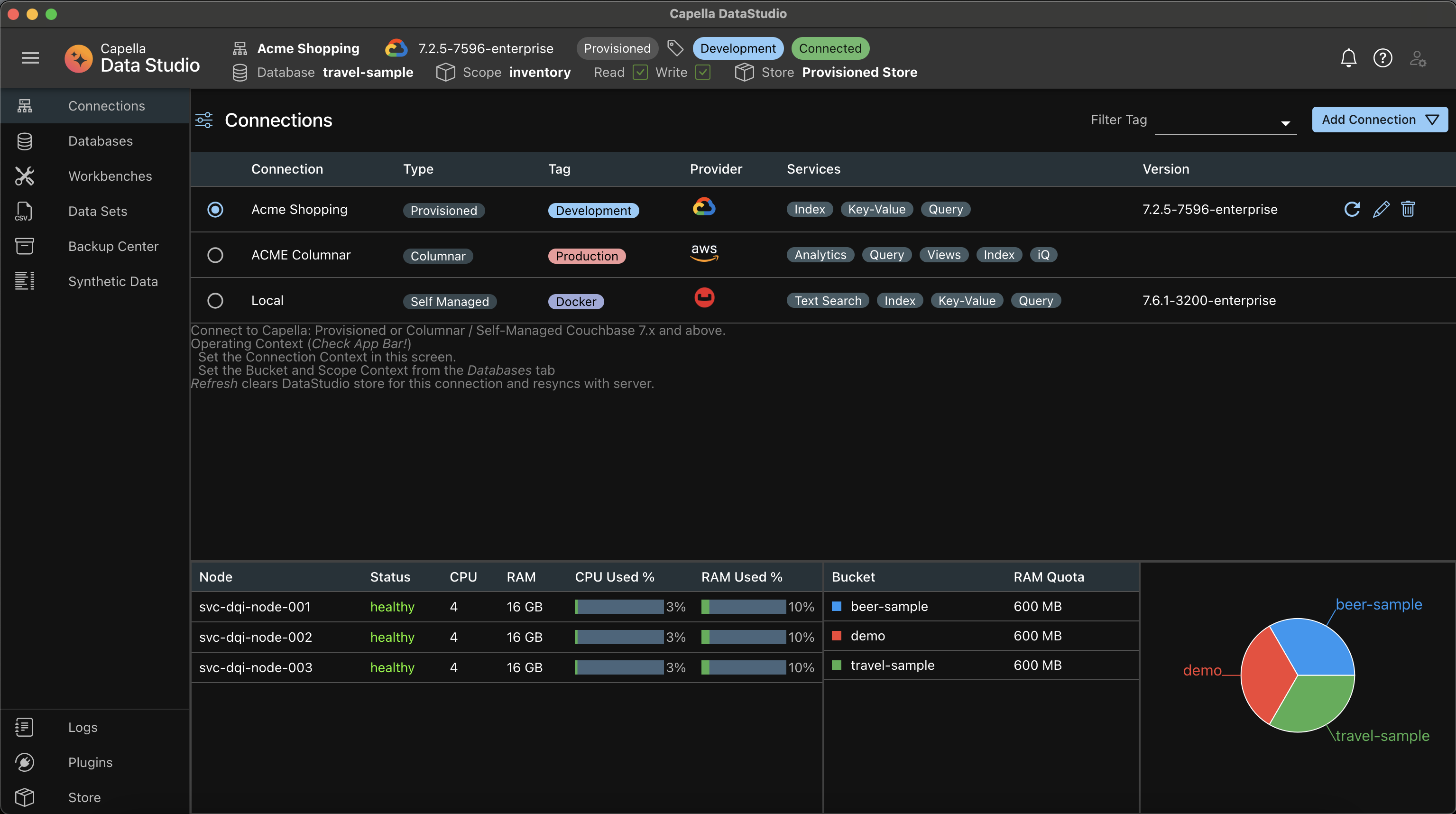
App Bar
On the left corner, there is a hambuger button. This expands or collapses the NavBar The middle shows the Context of where you are always.
- The Active Connection
- The Active Bucket and Scope
- The Active Store (more on this later) All actions will always be on these Active objects. On the extreme right are the Notifications Center (Bell Icon), the Doc Center (Question mark Icon) and the User Profile (User Icon)
Navigation Bar
The NavBar is where you will be navigating to the different features. A few things to note here:
- Menu items on the NavBar may be disabled depending on the Connection Type.
- Some of the features are under construction
Main Panel
This shows the details of the feature selected from the NavBar This may have one ore more sections, depending on the feature
Tip
Tip
Context! Always keep an eye on the AppBar and check out the Context which you are in.